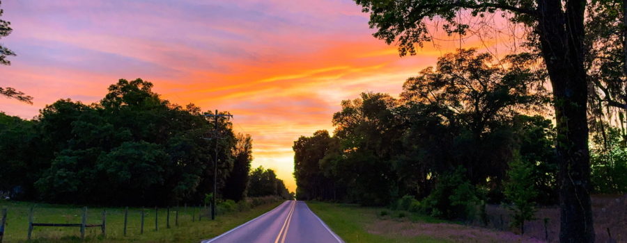
How to Take Great Nature Photos: Understand Balance

In the past we have discussed a number of the rules of composition in photography (or any other artistic endeavor, really). These things include the rule of thirds, using a frame to emphasize the subject, using leading lines, using new and interesting perspectives, and many more. Today I’d like to talk about using balance in your work. The rule of thirds is a component of balance, but balance is much more than just one rule. So exactly what is balance, you are probably asking. The best way to describe balance is as a seesaw or a scale. To get balance you need to have the same weight on either side. In the case of artistic composition, though, we are talking about visual weight rather than physical weight.

So how do we determine visual weight? Visual weight refers to how much attention is attracted by objects in your artwork. Things that tend to have high visual weight include things with bright or saturated colors, unusual things and patterns, large things (so, you see physical weight can be a part of visual weight), and the eyes of people or animals. All of these things tend to attract the eye of the viewer to one degree or another. In order to balance your composition, you need to position these objects in such a manner as to create symmetry. This does not necessarily mean physical symmetry. In the example below the main visual weight of the flower is the center, which is near the top and to the left. However, this is balanced out by the stamens coming out of that center and flowing downwards, and the single white petal flowing out of the frame to the right. Even though this image is definitely not physically symmetrical, it has a sense of visual balance.

A balanced composition gives the viewer a sense of relaxation and calm, while an unbalanced image creates a feeling of unease and restlessness. Either type of image is fine (ie a good artwork doesn’t have to be balanced). What matters is the feeling that you want to evoke with you work. For example, in a photo of a beautiful, misty, early morning sunrise, you probably want to keep your image balanced. After all, you are trying to create something to portray the peaceful calm of that time of day. On the other hand, in the example below the image is fairly physically symmetrical, but the main weight of the frog, it’s eyes, are off to the left of the composition and the head is looking away from the photographer. This creates a sense of uneasiness and restlessness. The idea is to make the viewer feel and see the tension in the frog. With only a small amount of imagination it’s easy to see the frog leaping away.

Hopefully, the above examples help you to understand that the important thing about using balance in your compositions is to help the viewer see and feel the emotion of the scene. Neither a balanced or an unbalanced composition is better. It depends on what emotions you are trying to evoke, and understanding what type of composition will be most effective at accomplishing that end. It definitely takes some practice to really see balance or lack of balance in your work and truly recognize it (especially lack of balance, I think), but if you take some time to evaluate your work and the work of others and consider the emotional impact of those images you will soon start to see it. So until next time, happy shooting, and have fun!


Recent Comments