How to Take Great Nature Photos: Follow the Rule of Thirds

Awhile back we discussed composition in general in nature photography, so now we are going to discuss several different composition “rules” that can help your photos to look awesome. Keep in mind that none of these rules are set in stone, so it is always up to you as an artist to decide what rules to follow and when to follow them. Some of them even contradict each other, but you can use them as guide lines in developing your own style. And as always, experiment with them and see what you like and what you don’t.

When I first started learning about photography (an ongoing effort I assure you!) one of the first rules of composition I encountered was the rule of thirds. It seems simple enough. Just divide your camera screen into thirds going both horizontally and vertically and try to place your main subject(s) where those lines would intersect. Most cameras have a grid that can be activated on the screen so that you don’t even have to guess where those intersections are. Similarly, most post processing programs also have a grid if you want one. I do recommend using those grids. I mean why not? I’m all for anything that makes things easier!

Why does the rule of thirds help make better compositions, you might ask? The answer is that the human eye and visual cortex work in such a way that the eyes tend to be drawn to those areas where the grid lines intersect rather than to the center of the image. By using the rule of thirds, we are simply taking advantage of that fact and placing our main subject where the eye will look first naturally. To most people, this tends to make our images more visually attractive and more balanced. We can even go a bit further if the main subject is a person or an animal by placing the eyes at that intersection point since the eyes tend to be the focal point of the image.

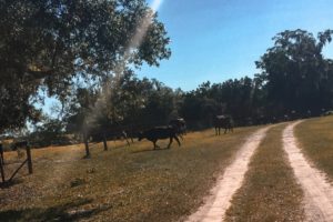
But what if we have more than one subject? Ideally we would then place the main subject or group of subjects on one of our intersections and our secondary subject(s) on another intersection. Of course, this isn’t always possible, especially when photographing animals who may not be wholly cooperative. In those cases, you would still want to try to place the main subject so it will draw the eye and leave the secondary subject where it falls.

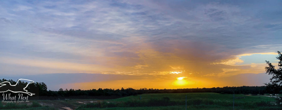
And what about landscapes, where the whole photograph is the main subject? First, decided if the whole image is the main subject or if there is actually one feature (a person, an animal, a boat, the sun, etc) that you might consider the main subject. If so, try to place it appropriately on the grid. If not, then consider at least placing the horizon in your photo along one of the horizontal lines. Again, the human eye tends to find this more attractive and less awkward than centering the horizon.

As stated earlier, even though the rule of thirds is a basic rule of photographic composition, it is not set in stone. Rules are meant to be broken, but in order to break them effectively, it is first necessary to understand them. So as with everything else in photography, experiment with your work. Take multiple photos with your subject(s) in different places if they are cooperative. If not, then try experimenting with subject placement in post processing. One of the great things about post processing is that you can try new things, but you can always undo them if you’re not happy with the results! Does anyone have something they would like to add about using the rule of thirds? We’d love to hear from you!


Recent Comments